Ever wonder how to best show your art…those pieces you have lovingly collected over the years? Top San Francisco designer, Linda Applewhite, presents 3 terrific ideas!
Linda Applewhite’s Design Tips
Play With Color and Texture
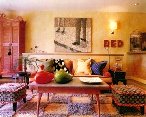
 To make artwork stand out in a room! Combine neutral toned art with a colorful interior as in this San Francisco loft. The black and white artwork, Street Scene, by Danish artist Gugger Petter pops amidst the reds, blues, golds and green, yet relates beautifully with the textured shag checkerboard carpet.
Good Design Repeats Itself
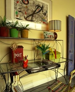
 Make artwork come alive! This Joan Miró lithograph, Trace #5, hanging above the custom made desk relates in feeling and movement to the desk. A powerful statement when teamed together.
Hang Artwork to Create Harmony and Surprise
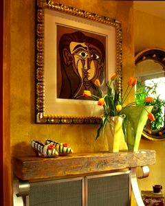
 This linocut, White Eyes, by Pablo Picasso looks stunning over the fireplace surround. The pairing of the elegant Spanish gold leaf frame and rustic wood mantle offer an interesting juxtaposition while the colors in the wood and artwork sing to one another.
Linda Applewhite is an artist, writer, spokesperson and renowned interior designer based in San Francisco.
To see more of Linda Applewhite’s design work visit her website at www.lindaapplewhite.com

Linda Applewhite has gotten to the core (pun intended) of the conundrum facing those who would optimize their art display. Thank you for sharing some of her imaginative/creative ideas.
Kirby, I loved the way you and Linda seemingly collaborated, regardless of process, i.e. by words or by osmosis. I think a kindred spirit had to be at work in there
somewhere. Each one of you can and does stand alone—-
but, oh, what a dynamic combination!
Jane
Ms Applewhite’s got the juxtapositioning genius gene. Thx for this interesting, informative blogpost, Kirby.
Nice blog, but what do you do when you’ve run out of wall space!!
We have surplus pictures stored untidily…